 Last week, I was able to share with you the incredible art work for my upcoming novel, Invasives, the second Radiants book, which will be out February 18. And because I’m mentioning the art here, I have yet another excuse to post the image, which I love and will share for even the most contrived of reasons . . .
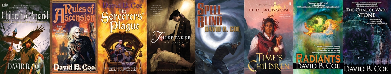
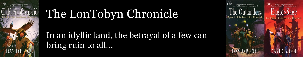
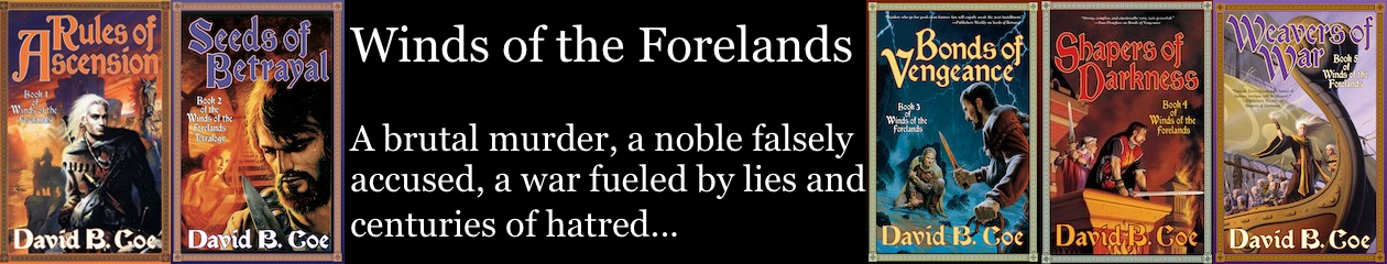
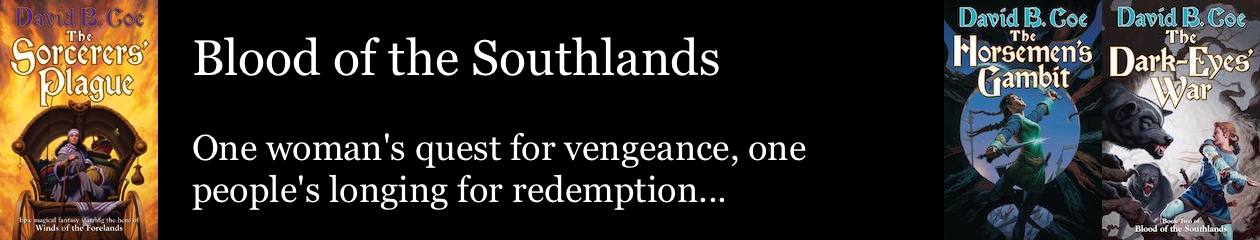
I have been fortunate throughout my career to have some really outstanding art work grace the covers of my novels. It began with my very first book, Children of Amarid, which had a striking wrap-around cover from artist Romas Kukalis. Romas did terrific work on the other two LonTobyn books as well, and also on the third, fourth, and fifth books of my Winds of the Forelands series (Gary Ruddell did books one and two), and the three volumes of Blood of the Southlands.
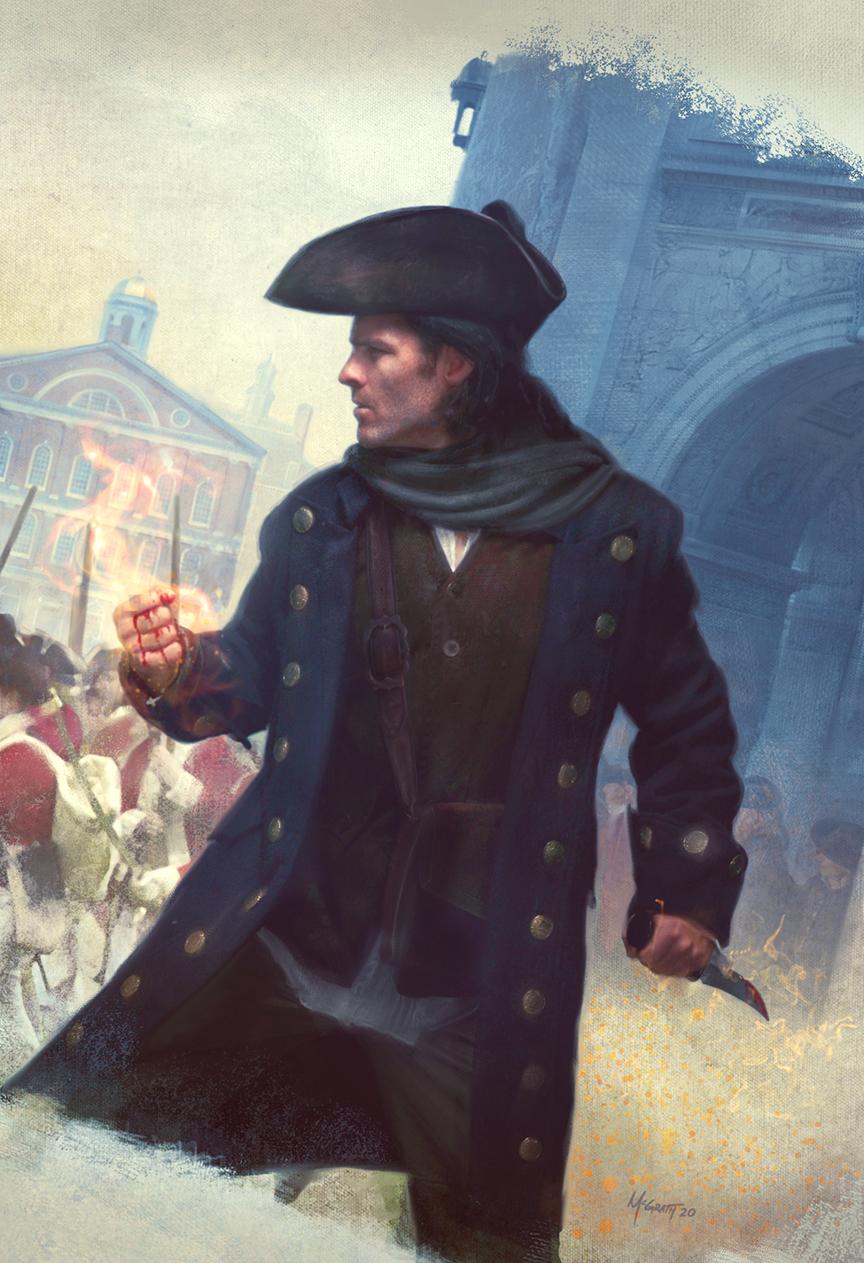
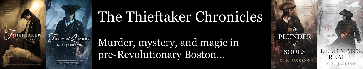
 For the Thieftaker novels, Tor hired the incomparable Chris McGrath, who has also done the art for the Lore Seekers Press publications of Tales of the Thieftaker (the Thieftaker short story collection) and The Loyalist Witch.
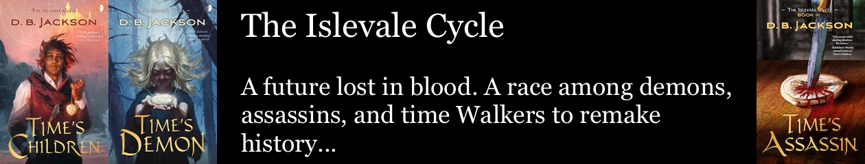
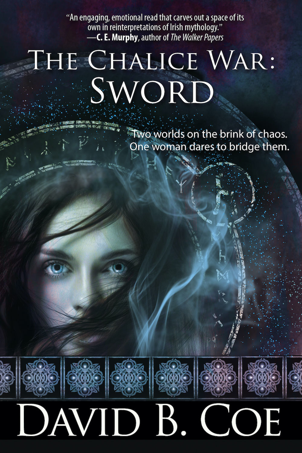
And I have had amazing art for the Islevale Cycle books (Jan Weßbecher and Robyne Pomroy) and for the Radiants series (Debra Dixon). As I say, I’ve been astonishingly lucky.
But does it matter?
“Don’t judge a book by its cover,” we’re told. And as a saying using the proverbial book as metaphor for others things in life, it makes lots of sense. But as a practical and literal (as well as literary) matter, it’s advice we ignore all the time. Of course we judge books by their covers. We do it every day, and one reason we do it is that publishers use cover art to signal genre, story-type, the age of a book’s intended readers, and even the possible series relationship between one book and another. We are programmed to judge books by their jacket art, and we have been for a long, long time.
The truth is, having cool jacket art can be a tremendous boost for a book. Need proof? Hang out by a bookseller’s table in the dealers’ room at the next convention you attend, and see which books shoppers ignore, which they linger over, and which they pick up and open. Covers matter. People are drawn to the Thieftaker books for several reasons. The blend of history, mystery, and magic helps. But few potential readers would know even that much about the books if not for the allure of those Chris McGrath covers.
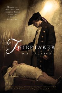 The thing to remember about artwork, though, is that it’s not enough for the covers to be eye-catching. They also need to tell a story — your story. The Thieftaker covers work because they convey the time period, they offer a suggestion of the mystery contained within, and they hint as well at magic, by always including that swirl of conjuring power in Ethan’s hand. The Islevale covers all have that golden timepiece in them, the chronofor, which enables my Walkers to move through time. All my traditional epic fantasy covers, from the LonTobyn books through the Forelands and Southlands series, convey a medieval fantasy vibe. Readers who see those books, even if they don’t know me or my work, will have an immediate sense of the stories contained within.
 And that’s what we want. Sure, part of what makes that Invasives cover work is the simple fact that it’s stunning. The eye, the flames, the lighting in the tunnel. It’s a terrific image. But it also tells you there is a supernatural story within. And while the tunnel “setting” is unusual, the presence of train tracks, wires, electric wiring, and even that loudspeaker in the upper left quadrant of the tunnel, combine to tell you the story takes place in our world (or something very much like it). And for those who have seen the cover of the first book in the series, Radiants, the eye and flames mark this new book as part of the same franchise. That’s effective packaging.
When I started in this business, and was writing for big publishing houses, I had relatively little input on my jacket art. Sometimes that was frustrating. Other times, it was fortuitous: I had an idea for the cover of the first Thieftaker book that was nothing like what Chris came up with. Thank God they didn’t listen to me.
In today’s publishing world, with so many authors self-publishing or working with small presses, which tend to be far more open to involving authors in these sorts of decisions, we have greater control over what our books look like. We also face challenges that didn’t exist back when I was starting out. Today, a cover doesn’t just need to look good in hand. It also needs to convey a sense of the story, genre, series, and audience age in thumbnail form. It doesn’t just need to stand out on a table in a bookstore. It also needs to compete with a dozen or three dozen other thumbnails on a single web page. Effective art is more important now than ever.
And yet, I don’t want to leave you with the sense that a great cover is the silver bullet for book marketing. Not even the coolest image can help you if the book within is poorly written or sloppily edited. Sure readers might fall for that once, sold on the book by the great image. But they won’t be fooled a second time.
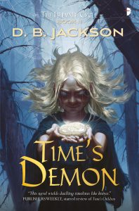 In the same vein, poor marketing practices by a publisher, even if inadvertent, can doom even the most beautiful book. I LOVE the art for Time’s Demon, the second Islevale novel. But the novel came out when the publisher was going through an intense reorganization. It got little or no marketing attention, and despite looking great and being in my view one of the best things I’ve written, it was pretty much the worst-selling book of my career.
Yes, art matters. Good art attracts readers and brands our books. But we still need to write the best story we can. And we still have to bust our butts marketing the book once it’s out.
Keep writing!

 Let’s start with the obvious:
 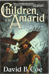 I’m asked quite often if I still feel the thrill of seeing a new book in print, even after so many years and so many releases. And the truth is, I do. Sure, the very first time was unlike anything I’ve experienced since. I still remember getting a call from the local bookstore here in our little college town. My author copies hadn’t arrived yet, so when the store manager reached out to let me know the hardcover edition of Children of Amarid was in stock, I rushed over to see it. I’m pretty sure Nancy came with me.
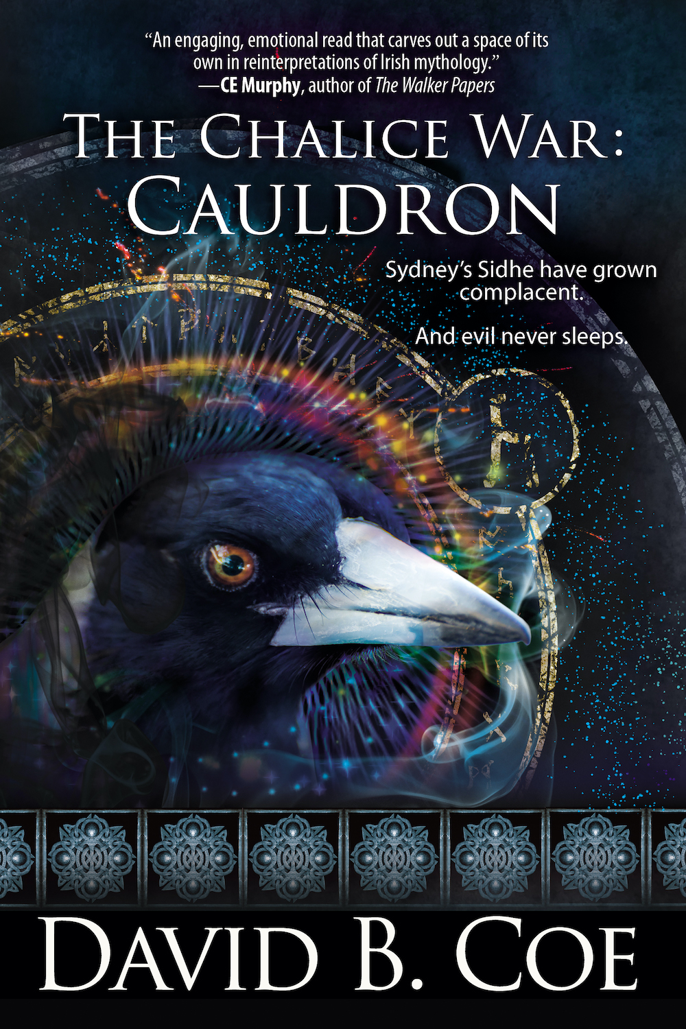
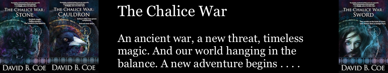
 With all this in mind, I am happy to say that the releases of The Chalice War: Stone and The Chalice War: Cauldron have gone great. No new pandemics. The stock market is up. The art work looks marvelous. All the chapters are just where they should be. (I think — I should probably check to be sure . . . . Yep, they look great!) Sales? I have no idea at this point. It’s too early to know. Reviews? We’ll see about those as well. I worry, of course. I want these books to succeed. I want you to like them. And, if you do, I would love for you to tell the world.
 As I have mentioned previously, the release of the first book in my upcoming Celtic urban fantasy, The Chalice War (